STRIVE
✦ Introduction
During my first on job training, I was placed in one of Sinarmas Mining’s business units named STAR Capital, focusing on financial services. The product that I worked on is STRIVE, an online trading app by PT. Aldiracita Sekuritas Indonesia.
✦ My Role
I took the role of a UI/UX Designer in Scrum sprints and worked with a product manager, a designer, a Head of Digital Business, a CTO, a technical program manager, content writers, and other stakeholders.
✦ Problem
STRIVE app is currently live and it offers various investment features. As of January 2023, it did not have an e-IPO feature, like other investment app competitors, namely Stockbit and Ajaib. The management team wanted to launch the new e-IPO feature so users have better and easier access to IPO stock information, hence they can buy or make IPO orders efficiently within the app.
✦ Goal
Highlight the new feature
With the new feature introduced, we aim to create an easy, straightforward, but still credible and realistic journey of purchasing an e-IPO stock.
Build a delightful experience
Make our design consistent so it reduces the workload on the engineering team and gives our users a consistent and convincing experience.
✦ Process
Research and Sprints
I did some benchmarking on other investment apps’ IPO features and I found some new opportunities that I could implement on the system. After conducting alignments with the product manager and designer, here is what we agreed to put into the app besides the IPO purchase feature:
Introduce a feature for users to see their IPO order history, hence they do not need to go to each IPO stock page to see their order.
Introduce a small IPO dashboard containing the number of ongoing IPOs and upcoming IPOs.
The purpose of the sprints is to make sure everyone has the same goal, which is to implement the IPO feature on the app with a seamless experience.
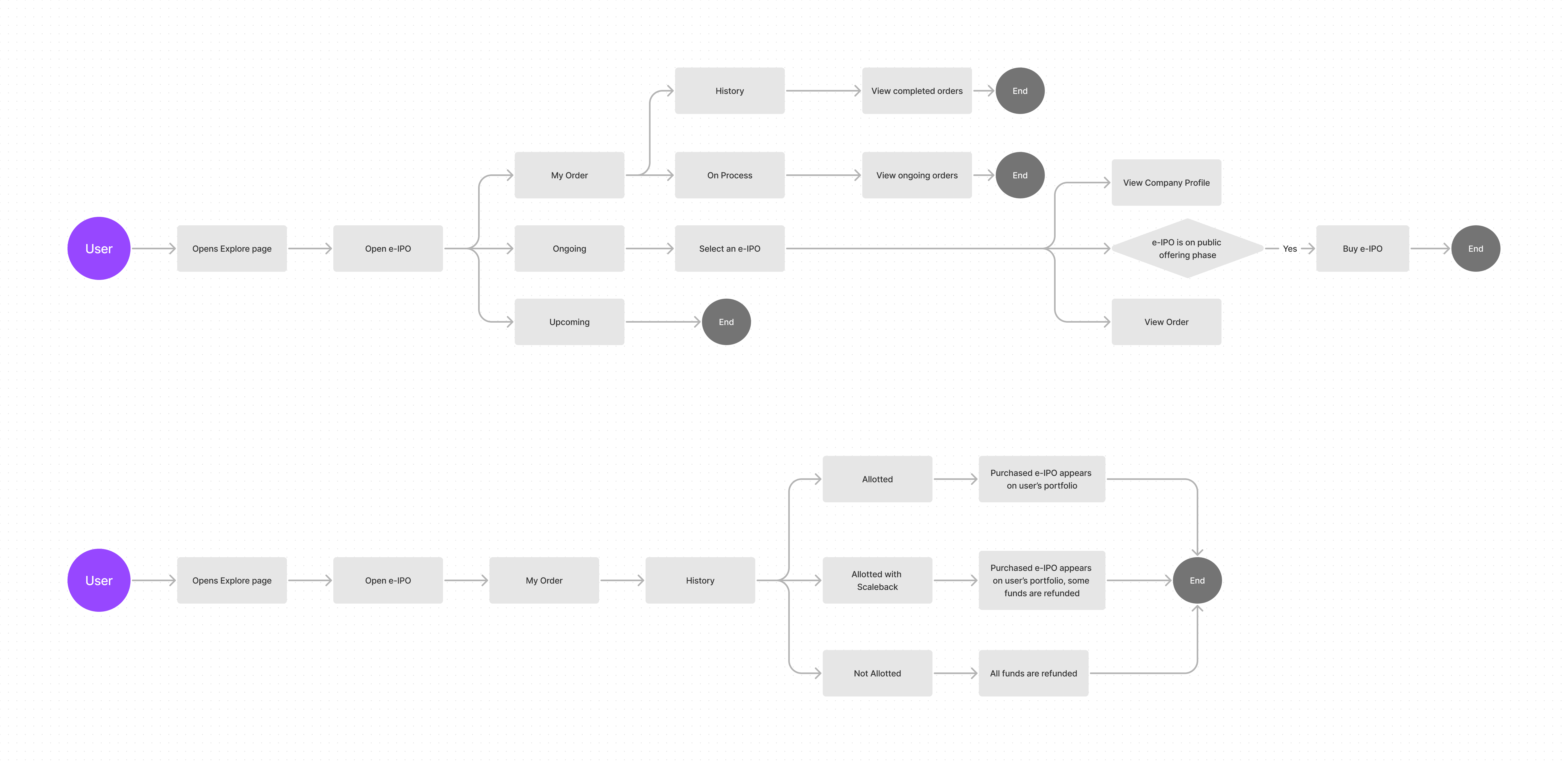
User Flows
Our team mapped the user flow for buying e-IPO and checking their e-IPO order result.
Early Designs
These are sneak peeks of my early designs, I created a few options to compare the design, user flow, and value proposition.
e-IPO Entry Point
We wanted to introduce the new IPO feature so at first, we put the entry point on the homepage. This did not make the cut as we wanted the app to focus more on other prioritized products and services. We ended up putting the entry point on the Explore page where users can see various products.

Order Cards Exploration

We went through around 3 design iterations along with discussions with a technical program manager, business team, management team, and product manager to ensure we have a friendly experience. I wish I could iterate more but the timeline was very short, only for 3 weeks.
✦ Final Design
The entry point for the e-IPO feature is placed on the Explore page. When a user first opens the menu, a tooltip will appear once, informing the user that there is a brand-new feature on the app.
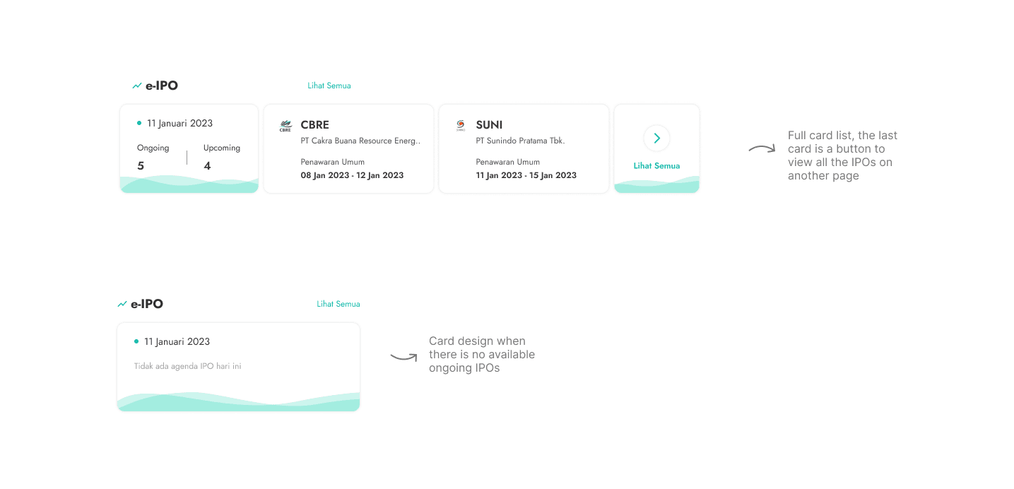
On the Explore page, there is a new section that contains a card list of the ongoing IPOs and an agenda card. The cards can be scrolled horizontally to save more space. The agenda card holds the information on the day’s date and the number of ongoing and upcoming IPOs.
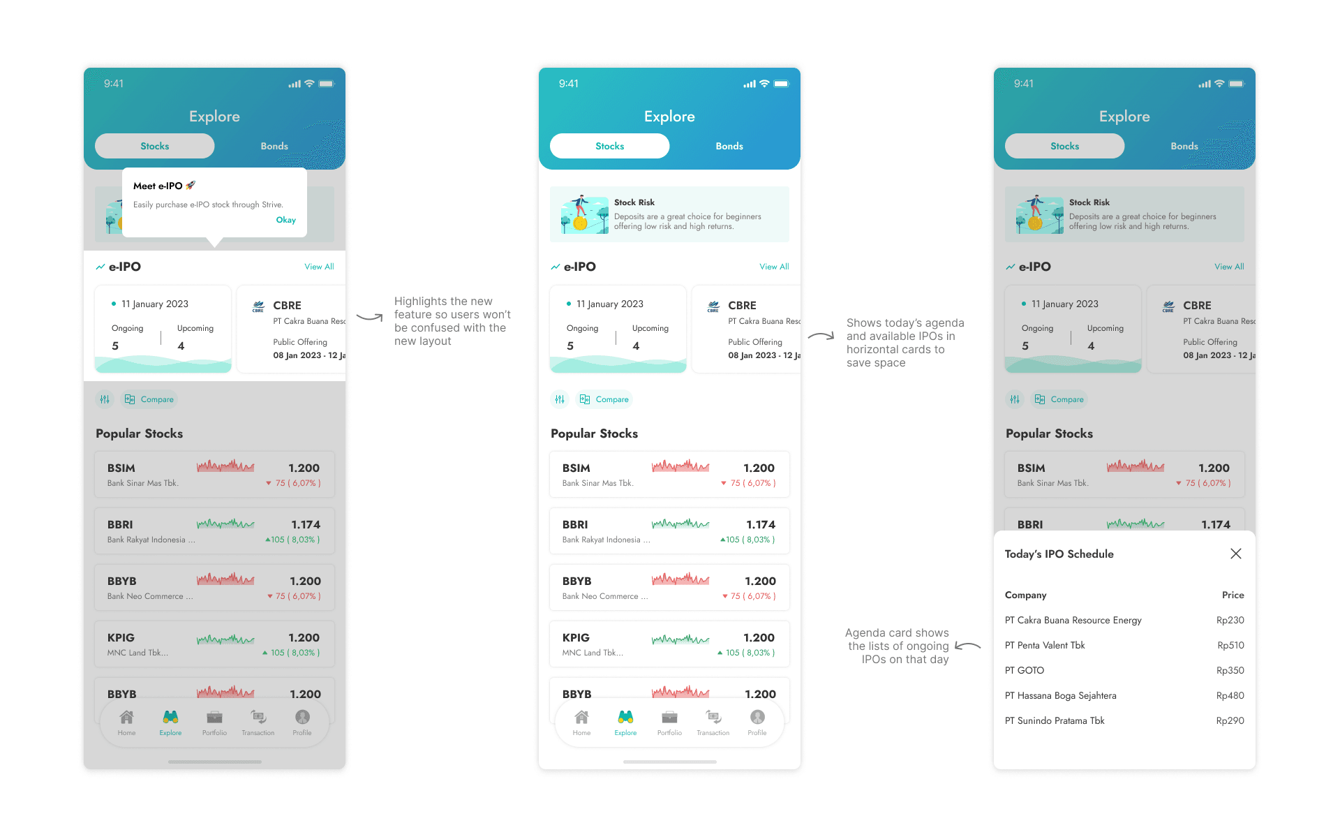
Below is the full card list for the e-IPOs and a card to show when there are no ongoing IPOs.
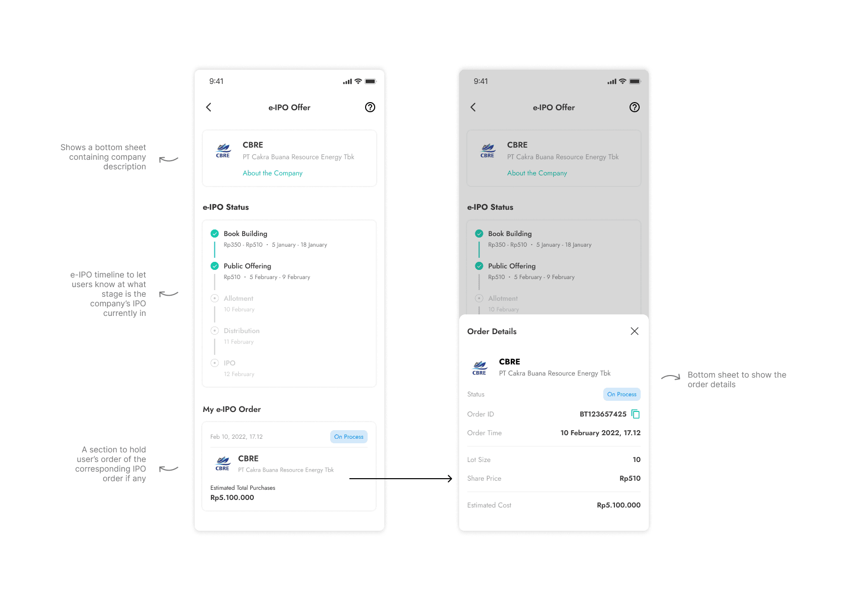
The e-IPO page has three tabs; My Order, Ongoing, and Upcoming. The My Order tab is split into two more tabs; History for completed orders and On Process for ongoing orders. When the card is clicked, a bottom sheet will pop up to show the order details.
The Ongoing tab contains e-IPOs in which the current timelines are public offering, allotment, distribution, and IPO. And the Upcoming tab contains e-IPOs which the current timeline is book building.

The e-IPO Offer page holds much information such as company description, timeline and status, and user’s orders.
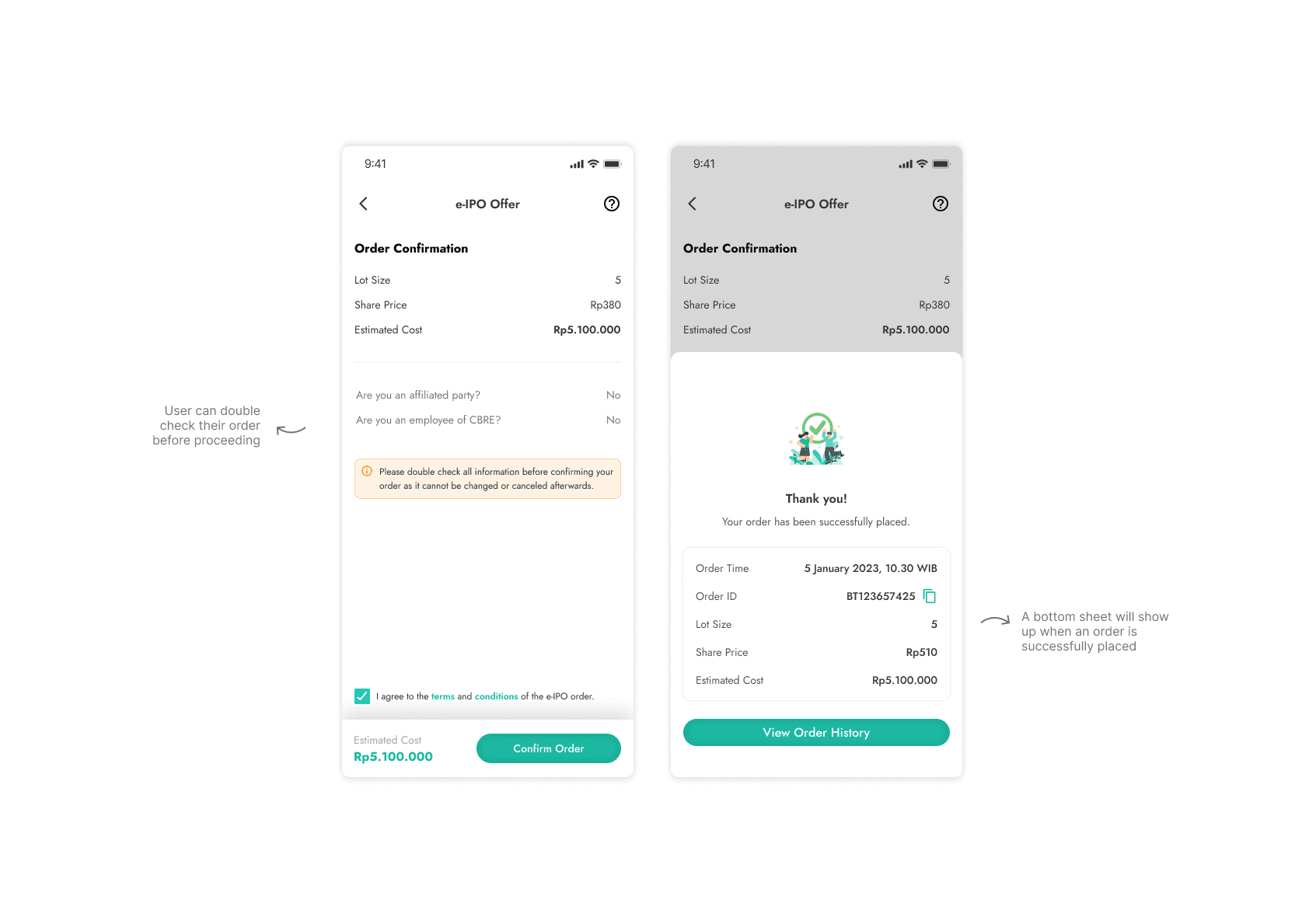
When a user wants to buy an e-IPO stock, they will be shown this page below. All they need to do is fill the lot size with their desired number. The estimated cost will dynamically update based on their query. When all the required inputs are filled, the button becomes active and the user can go to the next step.

The Order Confirmation page’s purpose is for users to recheck their inputs before proceeding and to agree on the terms and conditions of buying an e-IPO. A success message will appear when the order is successfully placed.
On the homepage, we additionally added a banner for users to buy e-IPO stock through the official website. But we wanted to encourage the users to choose us as the broker when purchasing the stock.
✦ What I Learned
Fast isn’t always better
When designing financial products, we are dealing with people’s money. During the design process, we always prioritize clarity and try to make the whole user journey legitimate. We do not tolerate unclear copy, unclear journey, and unclear design to make sure no users will be confused when using the feature.
I learned to create a concise copy in Bahasa Indonesia and English
Since there is no UX writer in the team and I am the main designer, I was also in charge of creating the copy. It was a challenge for me since I had to match my copy with the brand’s tone.
Breaking down tasks into multiple small ones
The timeline to design this feature was around three weeks (yep, pretty fast), and I was the main designer for this feature. I had to break down my tasks into small chunks hence I can focus one by one. I was also collaborating with my colleague who created the screen flows so the developers could understand the journey and design of the feature.
✦ Future Steps
Continue to design better experiences
I still think that the design system needs to be refined and scalable.
Test the design to real users
I wish I had the time to test the design to real users to gain feedback for future improvements. However, we had time constraints and the design needed to be developed very soon.