Stock Management App
✦ Introduction
A coffee shop needs a stock management app to track the quantity of their materials. The functionalities needed are viewing the current stock for each material, adding stock, editing stock, and adding a new item.
💡What the client wants
Simple and straightforward app
Easy to use
The app style needs to be coherent with the coffee shop brand
This app is also an internal app so it will only be used by the shop staff.
✦ Information Architecture
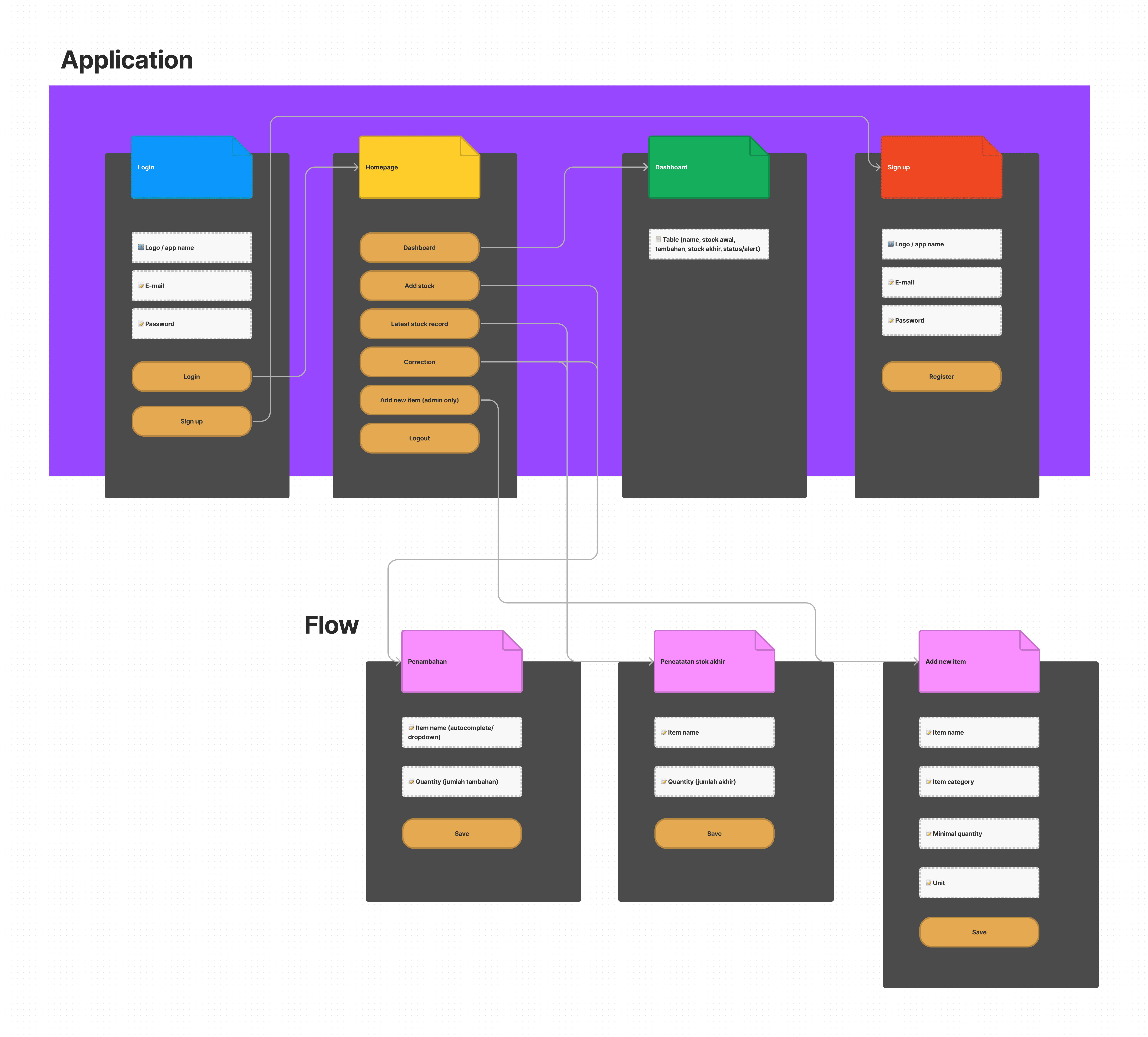
I made the information architecture of the app to ease my design process in the latter. The app is pretty simple and there aren’t too many functionalities. I put all the entry point buttons on the homepage to make everything simpler. Users can easily go to another page or flow.
✦ Final Designs
I designed the app using the Android screen size (360x640) because the client will also use mobile (not tablet or desktop) to run this app. I designed in the smallest size possible because it would be easier to scale up.
Login and sign up
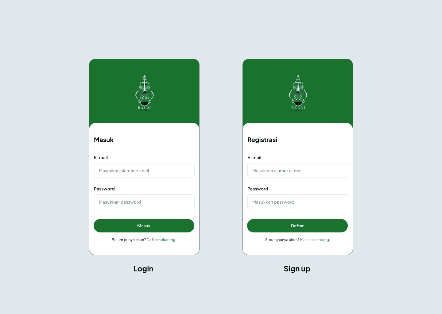
The picture above is the login page and sign-up page. The authentication type is password-based, therefore users only need to sign-up or login using e-mail and password.
Homepage and dashboard
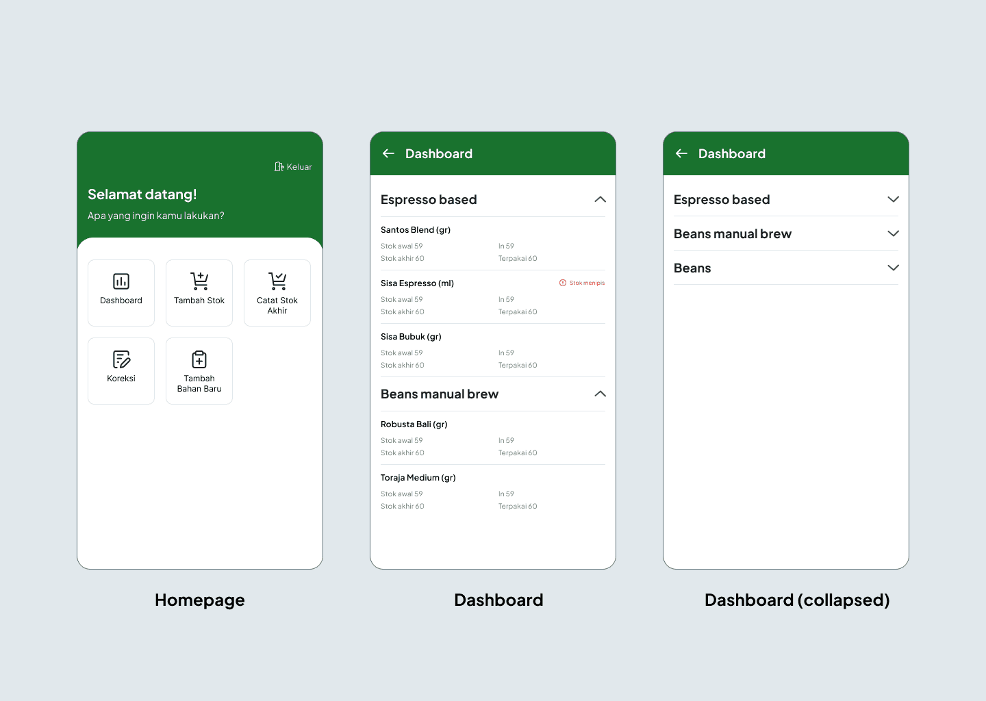
The homepage is the first page that pops up on the screen after a user successfully logged in. There is a greeting message on the screen to make the app feels more humanized. On the bottom of the text, there are card buttons to go to other pages.
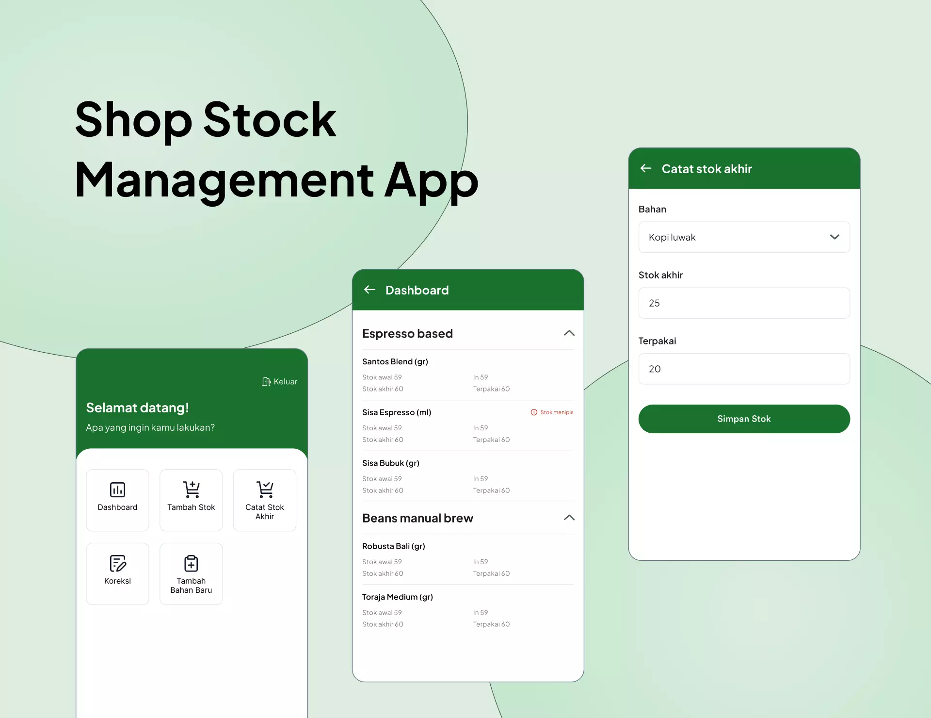
When the user clicks ‘Dashboard’ card, it leads the user to a simple dashboard page displayed in form of an accordion. The accordion header is filled with the category names for the materials (e.g: Espresso based, Beans manual brew, etc.). When the user expands one of the items, it will show all the materials that are included in the corresponding category. Each of the materials has information like name, unit, initial stock, latest stock, in (additional stock), and used stock. Whenever the material is running low, there will be an alert text to inform the user.
Add stock and record latest stock
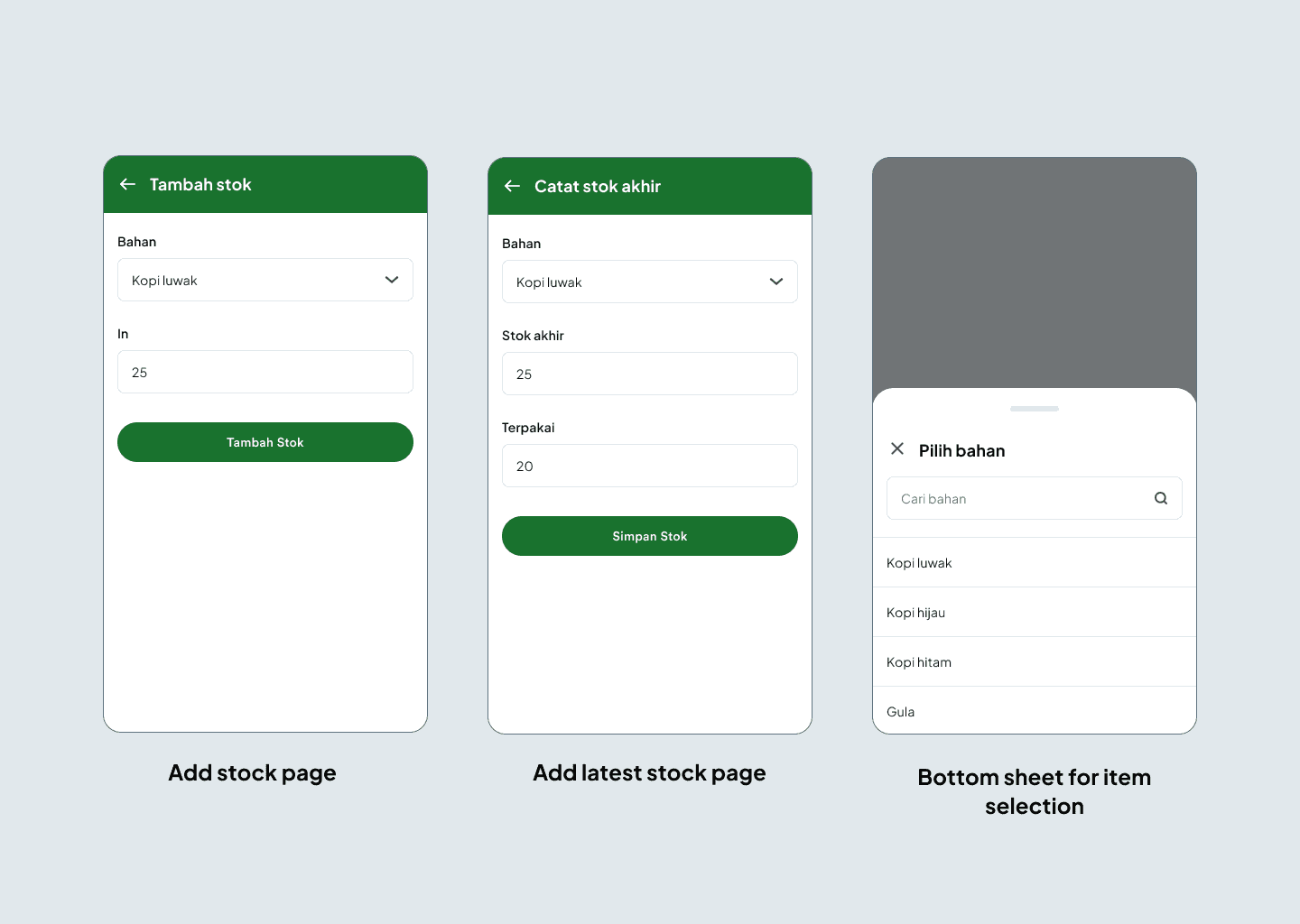
The picture above is the screens for adding stock and recording used stock and latest stock. To select the material, the app uses a dropdown that comes in form of a bottom sheet (right). From the bottom sheet, users can easily select the material or type in the search bar to quicken the process.
Stock correction
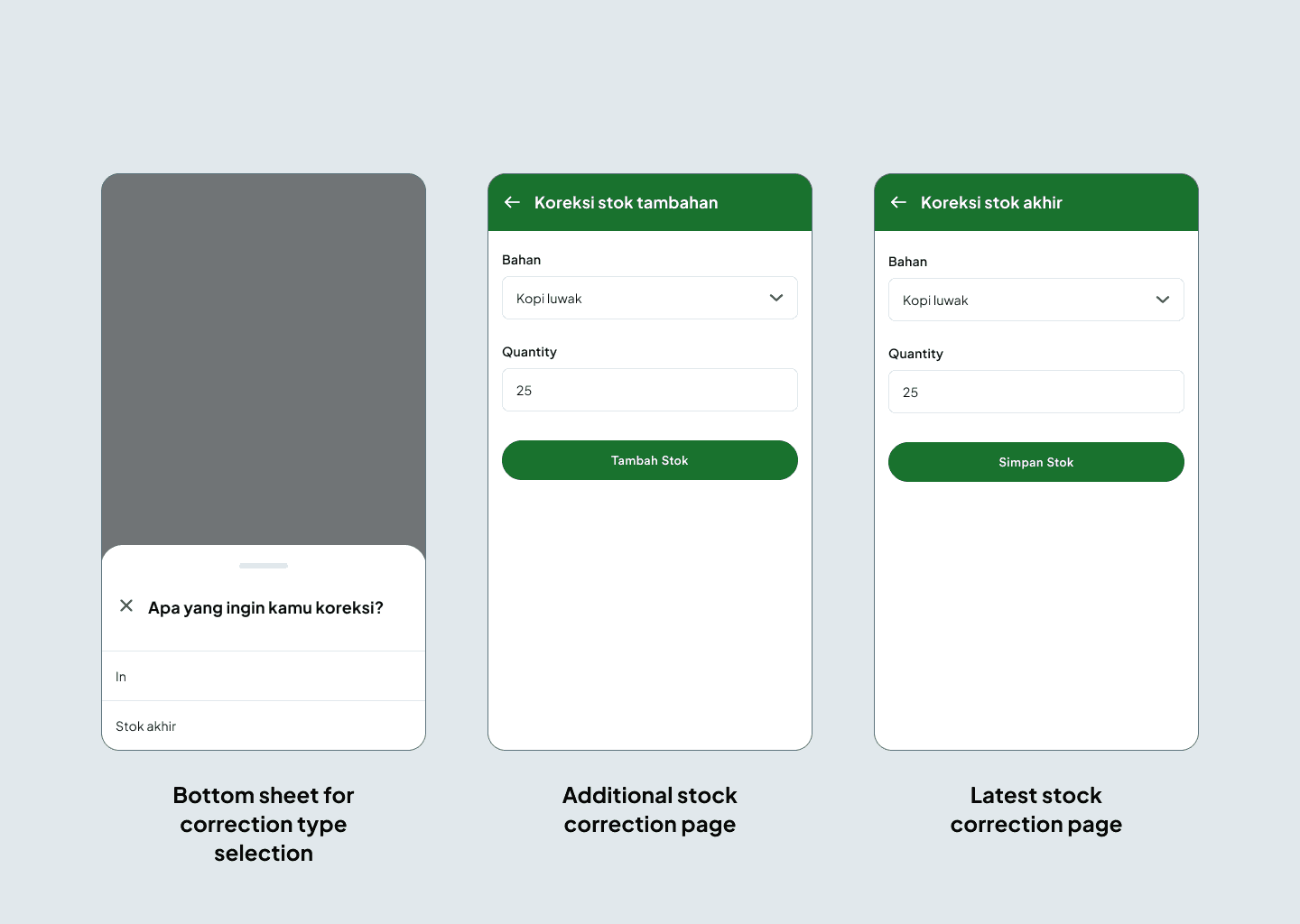
The bottom sheet for correction type selection pops up when a user clicks ‘Koreksi’ from the homepage. Users can choose what they want to correct, additional stock or latest stock.
Add new item
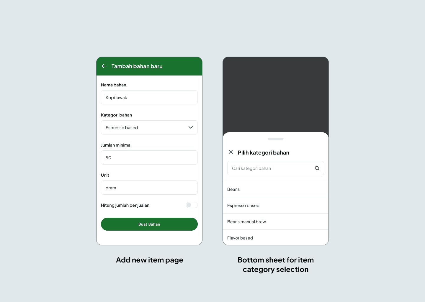
This page only appears for admins. It lets them add new material. Admins need to fill the name, category, minimum quantity, and unit. They also can check using the toggle if they want to count the sales.
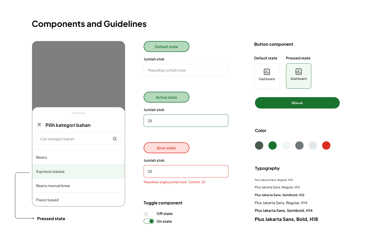
Components and Guidelines
✦ Iteration
The iteration happened once after reviewing with the client. The revision was about the copy in the app. I initially changed the copy to be more understandable and general, for example on add stock page, I wrote ‘Quantity’ for the input field text description, but the client wanted it to be ‘In’.
✦ Conclusions
Overall, this was a very fast project since we only had one month to finish the whole project (including the software). I took around a week to finish this design and the client was happy and satisfied.