
STARTrack
✦ Introduction
During my first on job training, I was placed in one of Sinarmas Mining’s business units named STAR Capital, focusing on financial services. I worked on a stock trading app called STARTrack, which is targeted for HNWIs (High Net Worth Individuals).
✦ My Role
I took the role of a UI/UX Designer in Scrum sprints and worked with a product manager, a designer, developers, and other stakeholders. The timeline for this project was around 5 weeks. I defined the whole design system for the app and designed the whole app by myself.
✦ Problem
The business team wanted to develop a new financial app, especially targeted for HNWIs. Our focus is on catering to HNWIs aged 40 years or older, ensuring that the app meets their unique needs and preferences.
✦ Goal
Establish trust and security
Given that the financial app is targeting High Net Worth Individuals (HNWIs), it's crucial to create a sense of trust and security in the design. HNWIs often have significant financial assets and prioritize confidentiality and privacy. Therefore, the goal is to design a system that instills trust, reassures users about the security measures in place, and maintains the utmost confidentiality of their financial information.
Build a system that is user-friendly and easy to navigate
Since our target users consist of older individuals who may have limited technological proficiency, it is crucial to design an interface that is straightforward and easily comprehensible to ensure a smooth user experience.
✦ Process
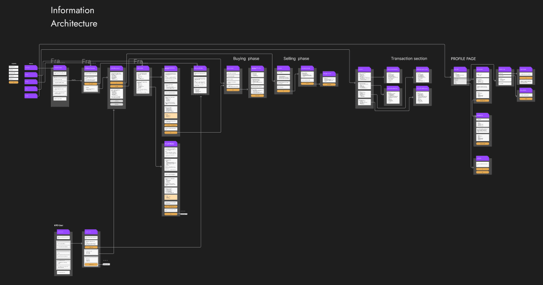
Information Architecture
Our team created an information architecture so all features are defined properly before we start the design process.
Early Designs
These are sneak peeks of my early designs, I created a few options to compare the design, user flow, and value proposition.
Segmented Control Instead of Heavy Interaction
We initially considered implementing a sliding interaction to conserve space; however, we recognized that this approach might not be familiar to our target users. As a result, we explored an alternative solution and decided to incorporate a segmented control. This allows our users to have immediate access to clearly visible buttons or entry points, eliminating the need for them to expend energy searching for options through sliding interactions.
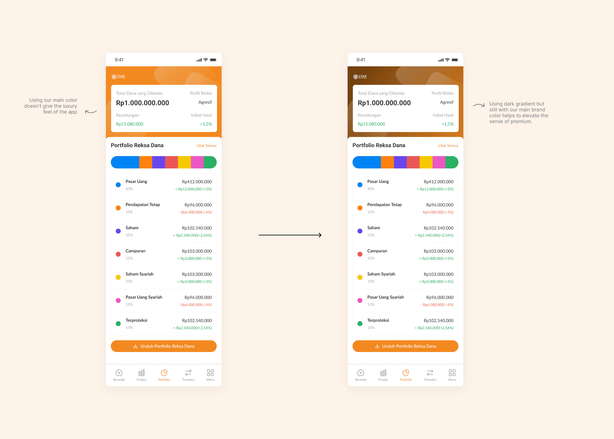
Dark Gradient to Emphasise the Sense of Luxury
After benchmarking other similar apps and researching, we agreed to go with incorporating gradient in our app to create a sense of premium and luxury. Since the brand’s main color is orange, we decided to go with a dark brown-ish gradient for the app’s aesthetic.
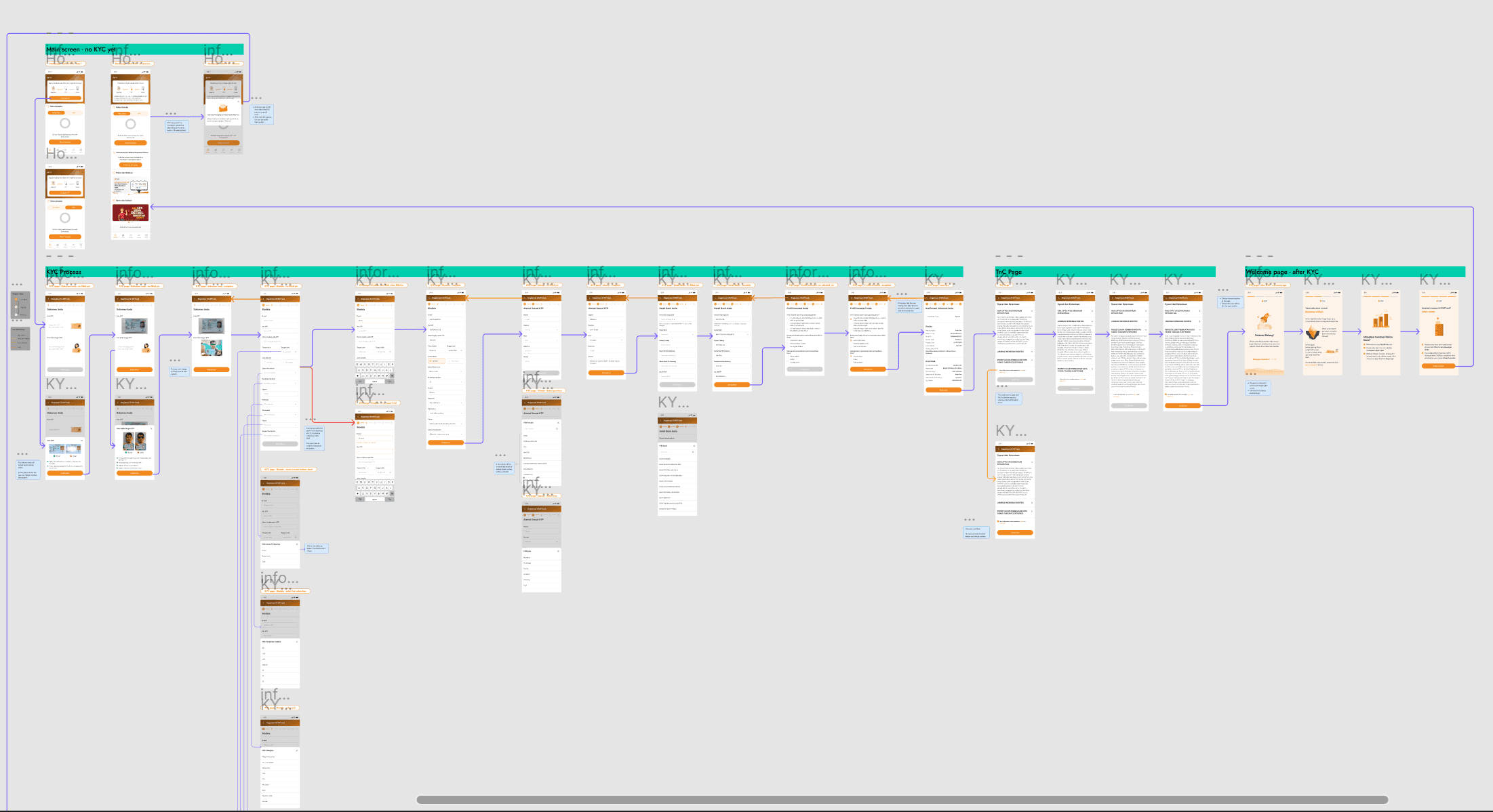
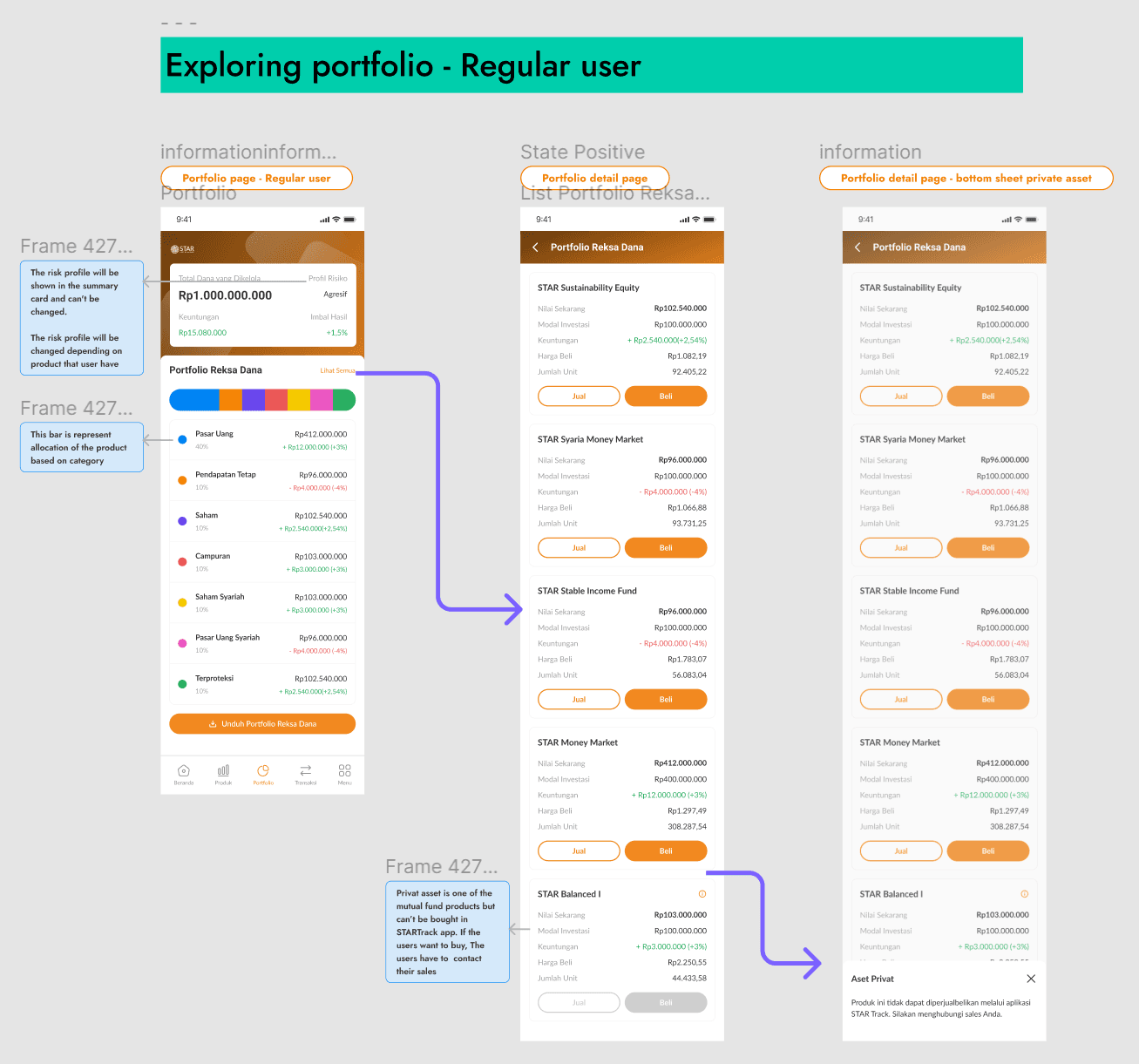
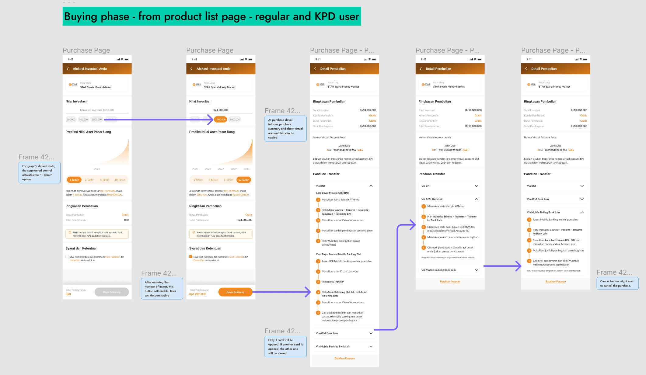
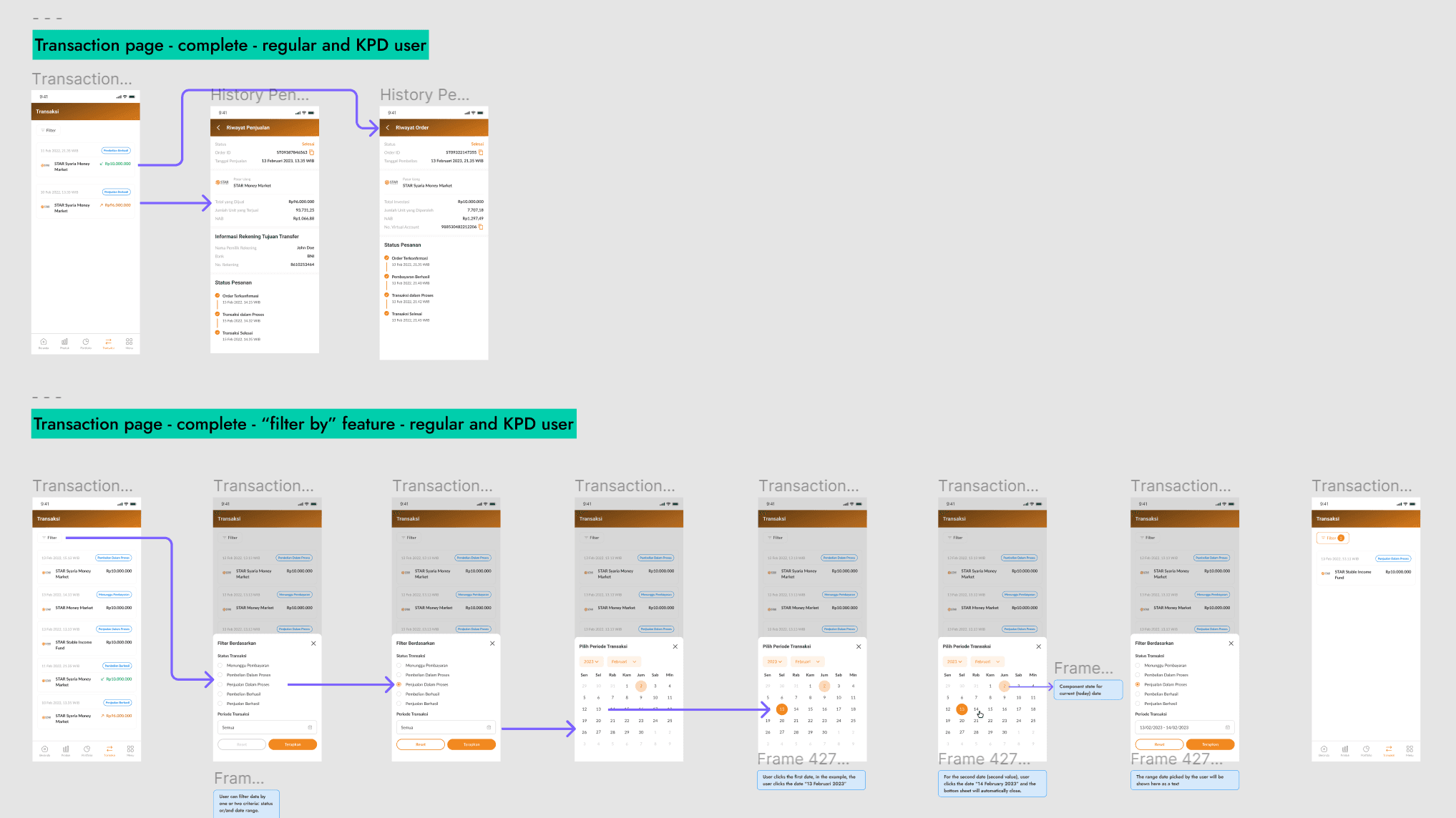
✦ Final Designs
Obviously, I cannot fit the whole app design on this page, but here are some flows that I designed. Including onboarding, e-KYC process, portfolio page, buying and selling flow, transaction flow, etc.

✦ What I Learned
Fast isn’t always better
When designing financial products, we are dealing with people’s money. During the design process, we always prioritize clarity and try to make the whole user journey legitimate. We do not tolerate unclear copy, unclear journey, and unclear design to make sure no users will be confused when using the feature.
Designing for specific target users that have limited technological proficiency
I learned the importance of simplicity and clarity in interface design. It is crucial to prioritize usability and minimize complexity to ensure a seamless user experience. Additionally, I gained insights into the significance of providing clear instructions and intuitive navigation to accommodate users who may be less familiar with the technology.
✦ Future Steps
Incorporating accessibility considerations to ensure inclusivity for users with diverse needs.
Conducting user testing sessions with the target users to gather valuable feedback and insights for iterative design enhancements.
Exploring ways to integrate user feedback mechanisms or implementing analytics to track user interactions can provide valuable data for continuous improvement of the user experience
Improve the design system and make the documentation. I did not have much time to develop the design system. Therefore if I have time, I will definitely improve the design system and create documentation for a better design process in the future.