
SC Landing Page
✦ Background
STAR Capital is a well-established global investment holding company with a strong presence in Energy, Infrastructure and Financial Services sectors.
✦ Problem
The current landing page of STAR Capital has a lot of visual problems, poor copywriting, and overall it fails to convey the company’s status as a global investment holding company. Below is the landing page design
✦ Goals
To establish trust and security towards visitors
To improve content strategy
✦ Target Users
Local and global investors
Potential partners
✦ Design Process
We began with a kick-off meeting where we gathered requirements from the client. This helped us get a clear picture of the client's vision for their website. During the design process, I made two style options, which helped my team understand the client's preferences. We went through 6-7 revisions before finalizing the design.
✦ Project Result
The new landing page is now live on starcap.vip 🥳
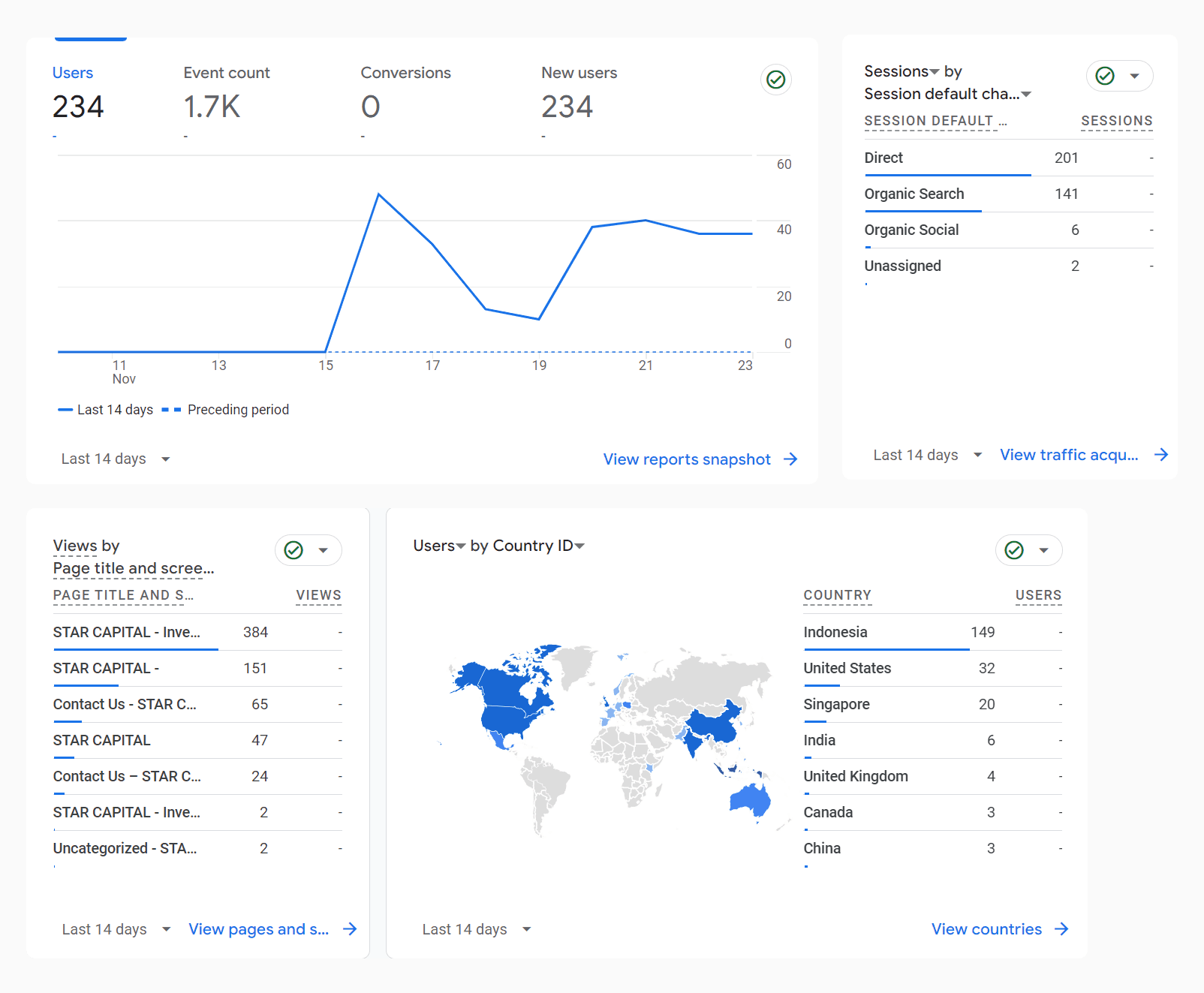
Two weeks after deployment, the website shows impressive performance despite no official launch. Below is a snapshot from the website's Google Analytics and it amassed 200+ visitors!
✦ Key Takeaways
I learned about branding beyond just UI/UX design when I made slight changes to the primary colors used on the website.
I was able to create a website that perfectly balanced professionalism with a casual feel. The client specifically requested a corporate website that didn't come off as too rigid or formal.