Asuransi Astra
✦ Role and Tools
My role during the internship was UI/UX Designer. I worked with UI/UX analyst, UI/UX designers, UX writer, product owners, and leads from Asuransi Astra.
Tools used: Figma, Microsoft Teams, JIRA, Google Meet, Discord
✦ Projects
There are three main things that I did during the internship:
Revising the upcoming mobile app (including creating illustrations and redesigning product icons)
Developing conversational UI feature (including helping create the conversation flow and copy)
Revamping the website. The existing website hasn’t been updated since 2015. The company wanted to bring a more modern, clean, and structured website.
✦ [Web] Payment Journey
Problem
The existing payment journey takes up a lot of space and is designed poorly.
Research and Insights
After understanding the payment methods that Garda Oto can accept, there is an opportunity to design a better and faster journey.
Goal
As a user, I want to be able to choose and set up my payment method easily to pay for the insurance during the purchasing process.
Solution
By implementing a popup for this feature, it saves more space and makes the component more stand out, therefore it helps users focus on their available choices. In this popup, I directly show all the available methods. As for credit card and instant payment methods, users need to complete a few more information.
Below is the first interface a user sees when starting the payment journey. A user can choose their preferred method. This popup is scrollable.
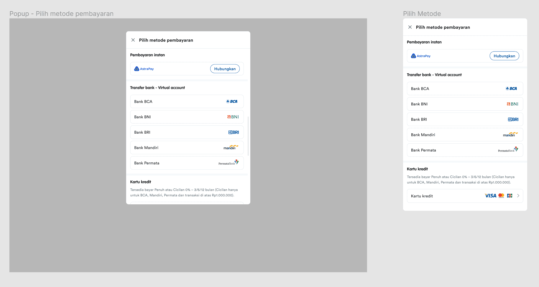
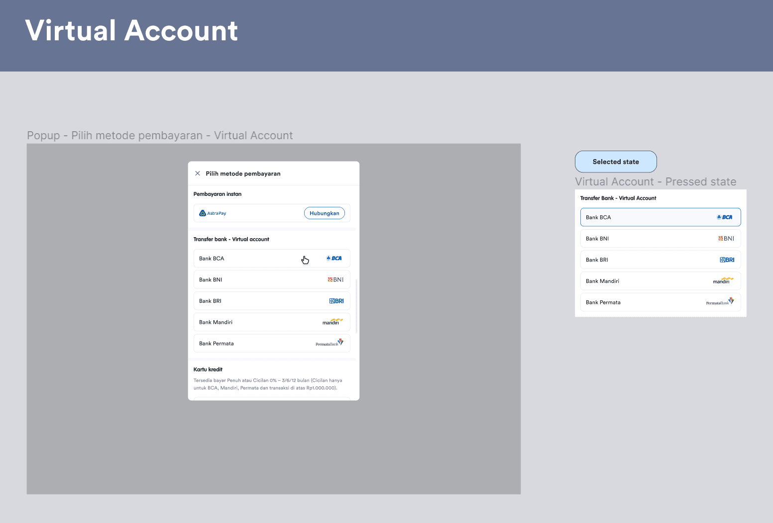
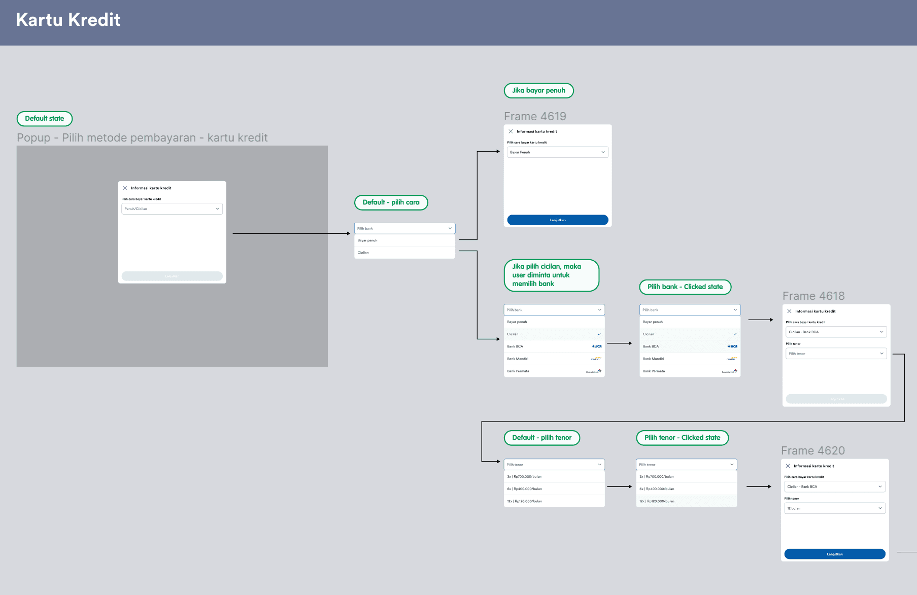
Below are the screens for each payment method.

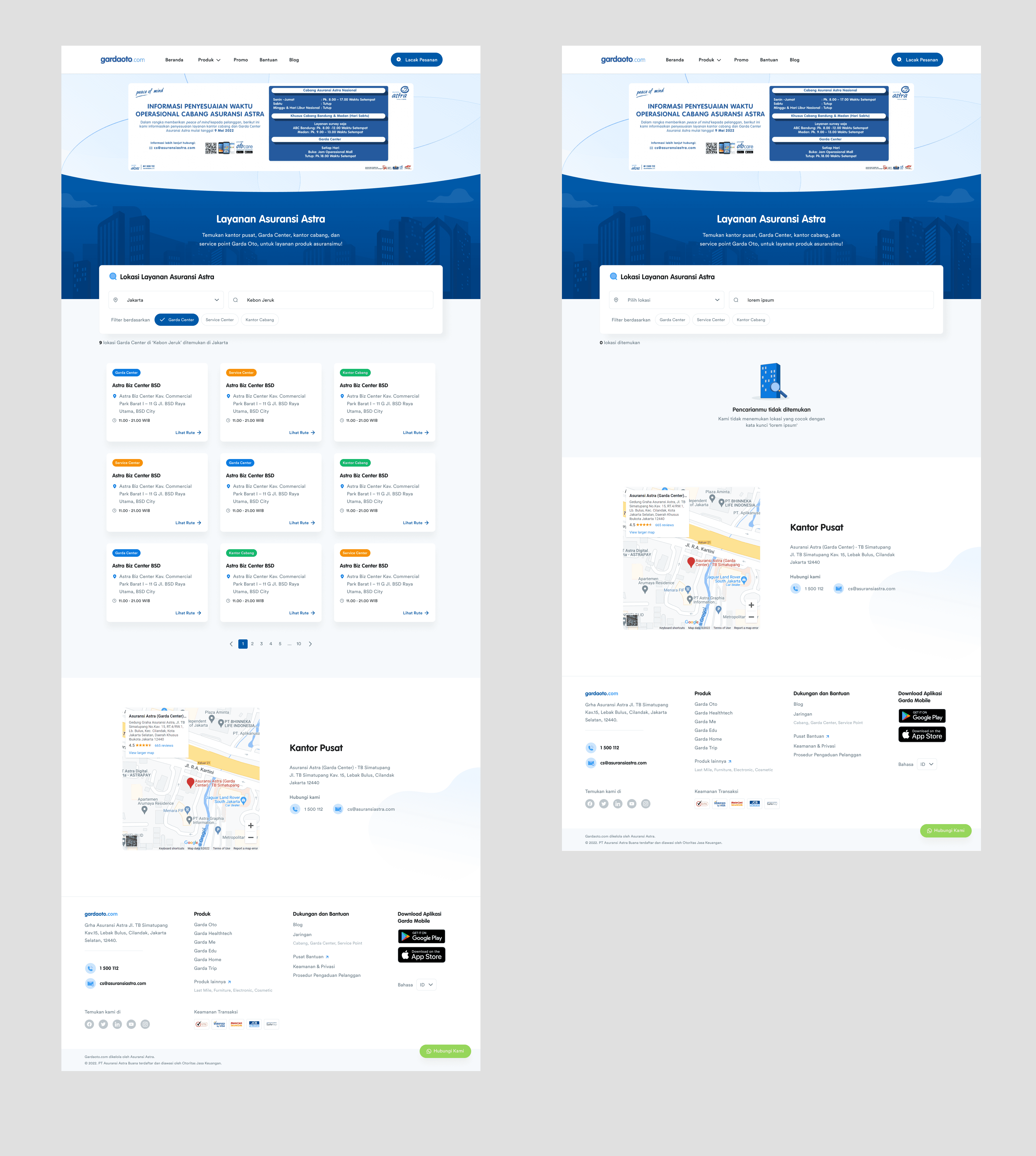
✦ [Web] Service Page
Problem
The existing service page design is outdated and it doesn’t use colors to communicate the message. It also lacks of function which leads to longer journey time for users.
Goal
As a user, I want to be able to find an Asuransi Astra network swiftly.
Solution
On this newly designed page, a user can see a banner on the top of the page, a search box, a list of Asuransi Astra’s network presented in cards, and Asuransi Astra’s headquarter info.
The banner is a high priority, therefore it should be placed on top to gain users’ attention. This section is important because it contains the working hours of Asuransi Astra’s networks and we assume that users who visit this page are planning to visit a network.
The search box applies multi-filter, therefore users can filter by cities, network types, or anything they type on the search bar. The result will automatically update every time there is a value change in the search box. This results in a faster journey for users to find a network, compared to the existing design where users can only filter by type and by city.
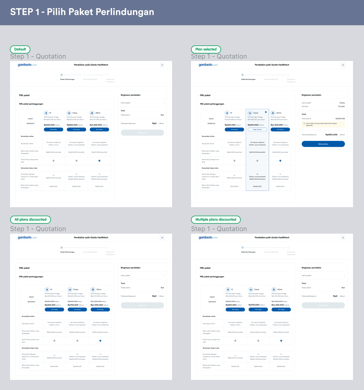
✦ [Web] Purchase Journey
Problem
The existing Garda Healthtech purchase page has too many texts which can lead to frustration. It also has repetitive texts for the same intention.
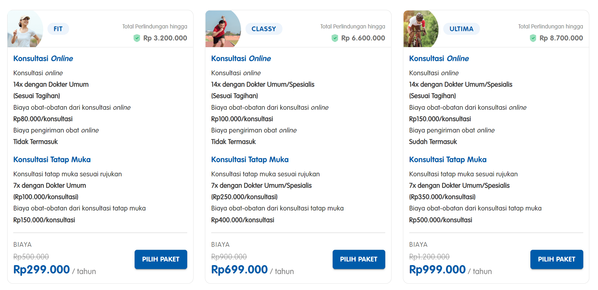
Goal
As a user, I want to be able to easily compare the benefits between available plans.
Solution
Because our users need to compare between plans, we can reduce users’ cognitive load by eliminating repetition. In this case, I use tables to compare the plans, which makes the design more breathable and easier to comprehend.
Desktop version
In the first step, a user chooses their preferred plan. The three plans are displayed in form of a table because the three have similar benefits, but just different values. Instead of re-writing the same benefits for each plan and increasing cognitive load for users, a table is a great option! Users can select the plan by clicking the corresponding button. The selected plan will dynamically update the purchase summary (Ringkasan pembelian) and users can go to the next step.
In the second step, a user fills their personal information. After all fields are filled and valid, users can go to the final step. Or they can also go back to the previous step in case they need to change the plan.

In the last step, a user can read their selected plan and personal information before proceeding to buy the policy.
Mobile view version
The mobile view version uses a lot of bottom sheets to handle long content.

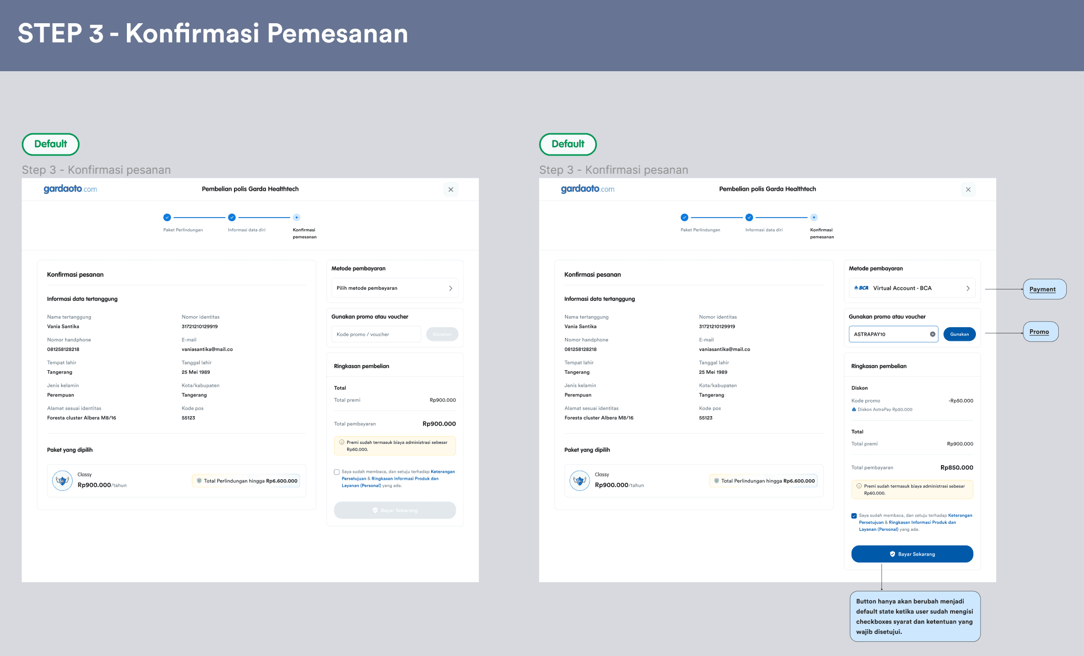
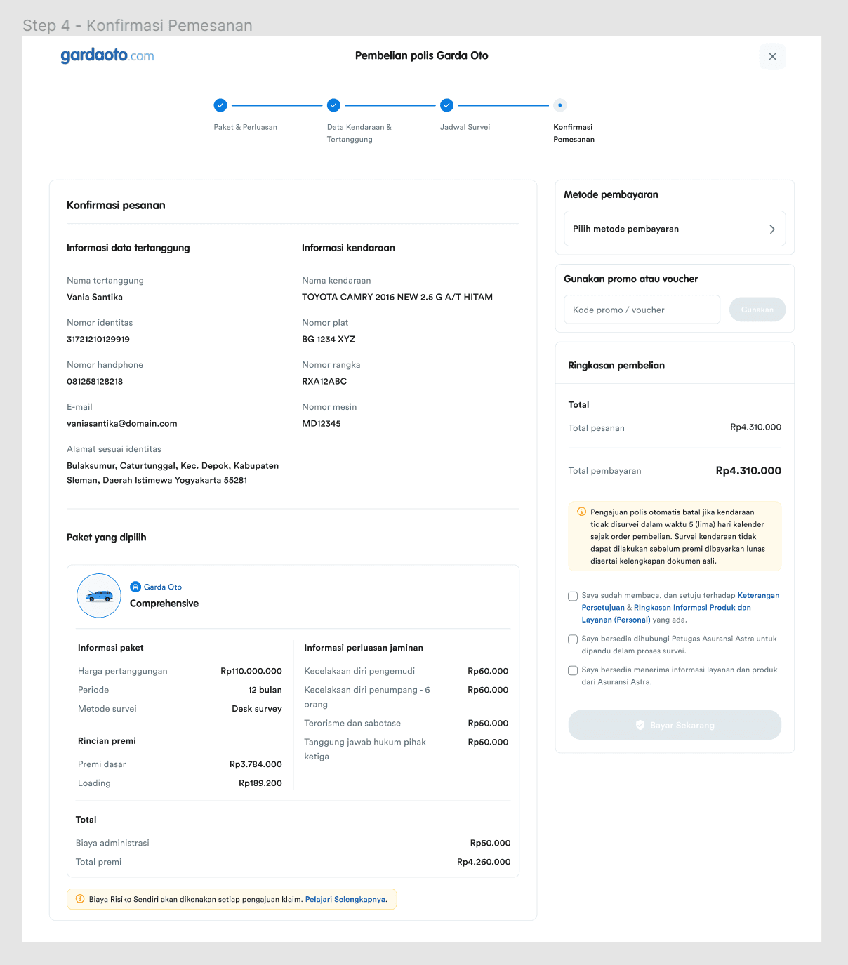
✦ [Web] Order Confirmation Page
Problem
The existing order confirmation page shows all the information in a single column therefore the page is long and it doesn’t utilize the available space. The payment method section is also below the previous section therefore this page looks all over the place.
Goal
As a user, I want to be able to recheck my information before proceeding to payment.
Solution
On this newly designed page, I see the opportunity to use columns to display the information to utilize the space. Below the personal information, I put the selected plan and its benefits so users can easily recheck their selected plans and benefits.
✦ [Web] FAQ Page
This FAQ page is unique for every product. Below is the FAQ page for Garda Healthtech. I also created for other products. It uses accordions because currently the questions are not numerous and the content (answers) are acceptable to be shown with accordions.

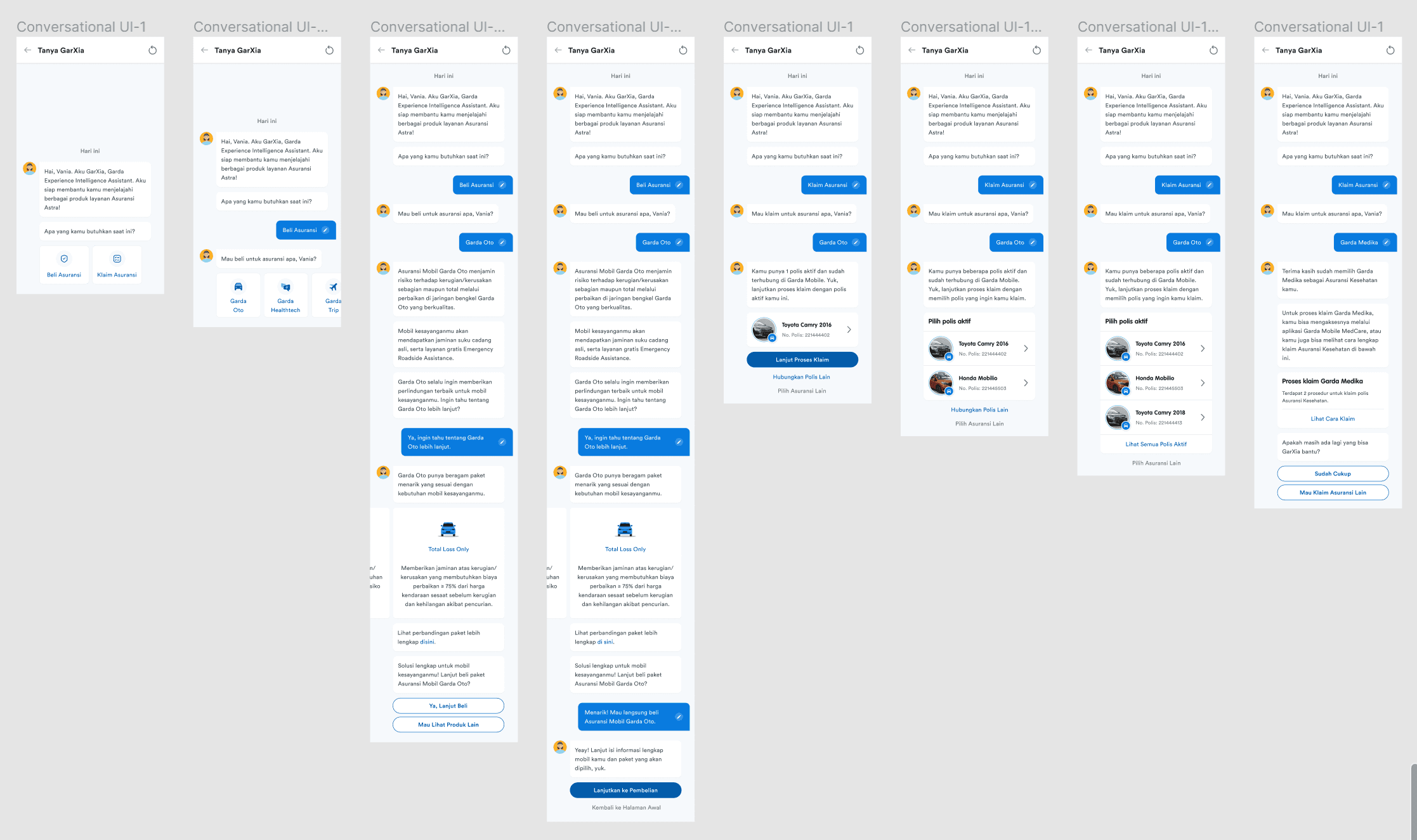
✦ [Mobile] Conversational UI
This feature will be developed in Asuransi Astra’s new mobile app (at that time, the business hasn't decided the app name). This feature’s purpose is to help users buy or claim a policy. It also help users to compare different plans and see which policy fits best their needs. I made all the components for this conversational UI.
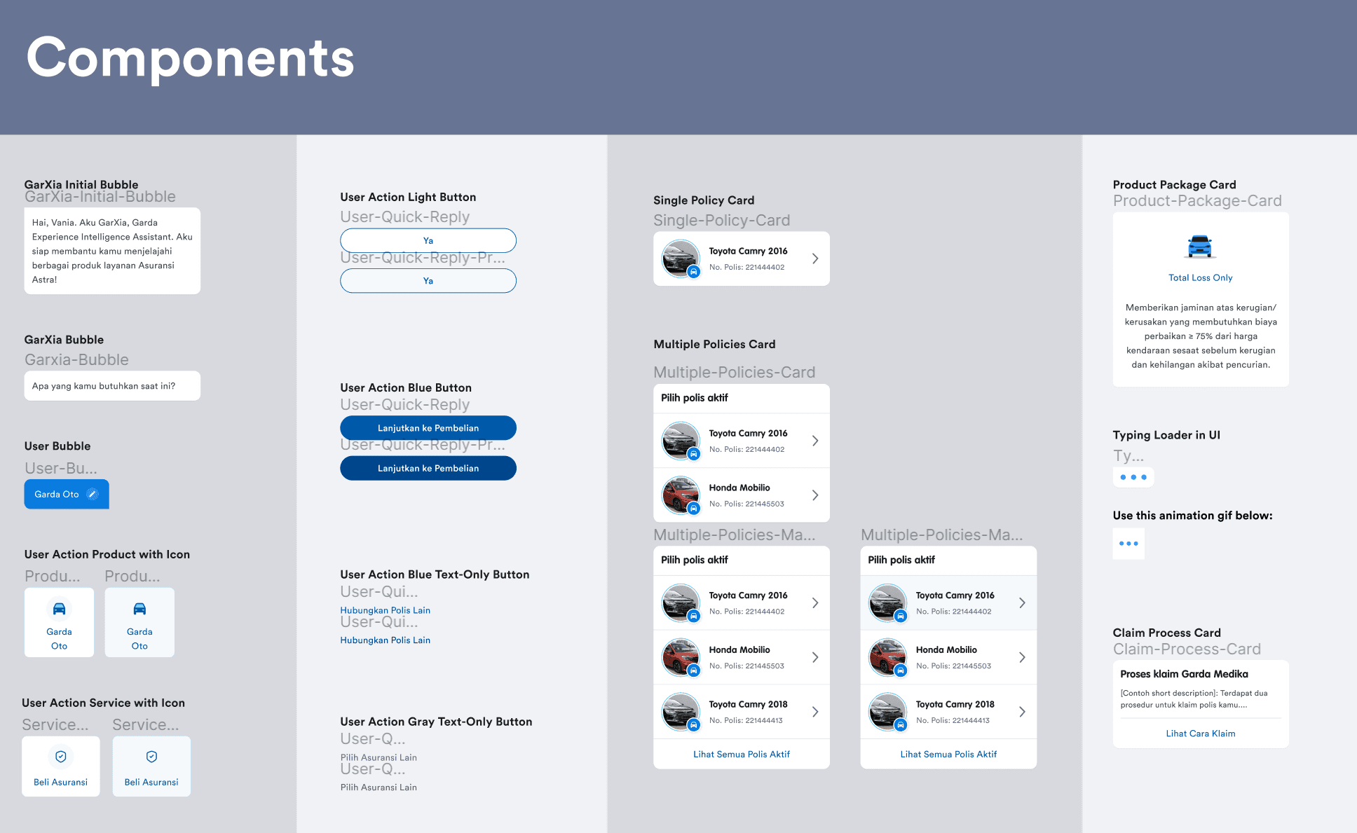
Below are some interfaces from the conversational UI (unordered) to show the use of the components. I created this design based on the product requirements. This design mainly uses quick-action buttons, carousels, and cards.
✦ Learnings
I was so grateful for this internship because as I said, this was my very first UI/UX internship. It has provided me with valuable experience in designing real digital products and collaborating with cross-functional teams. Not only in terms of designing, I also learned to quickly translate business requirements into designs.